Predicting the (Wireless) Future
I’ll admit, the title may be far more grand than the point I’m getting across. After all, I’m not making a prediction about where the wireless business is going (we might eventually get to 802.11ac wave 2) or as to how broadcast radio is continuing to evolve in the UK (more consolidation still to come and no, mobile networks aren’t going to be the broadcast platform of choice in this generation’s technology).
It’s all actually a bit more humble and relates to the wireless network infrastructure across a campus I have a hand in supporting. For ages, we’ve been looking for a good metric to determine the performance and experience for end users. A simple coverage metric is too easily cheated – a single 4W ERP AP on our tallest building would technically tick that box, even if no-one could realistically use it. On top of that, modern controller-managed networks are continually monitoring and adjusting RF parameters. Losing an AP generally isn’t a problem and rarely sees a sizable loss in coverage.
We could instead measure client throughput. After all, that’s what people generally care about. However, monitoring the raw data throughput doesn’t tell us how well the system is working for clients. A low throughput could be either a low bandwidth application or client struggling to maintain a good connection.
That’s where “goodput” is supposed to come in. It takes the total amount of data transmitted, the air interface speed used and accounts for the time taken as well. In an noisy RF environment, that means the extra re-transmissions from lost frames reduce the goodput, even if the raw throughput figure is much higher. While this isn’t a perfect metric, it does get us a bit closer to what we actually want to measure.
But that’s where we run into another problem. While our wireless controllers do offer up some goodput data, even down to the AP level, it’s not offered through SNMP. Cue the “A Team” music, a bit of shifty watching web requests through the browser’s developer tools and I’ve got a script that can make the right API requests. While I’m not in a position to share how the script works (we’d quite like it to keep working…) I can say that getting the data isn’t difficult.
With the data now available, the next issue is both storing and visualising the it. That’s where RRDtool comes in. With a simple logging configuration, we end up with something similar to the graphs below for both overall goodput and a single AP group.
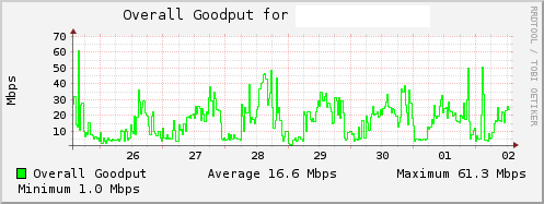
Overall goodput for a single wireless controller.
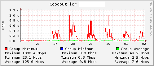
Goodput measurements for a single AP group.
As you can see, it’s enough to get a good idea of what usage patterns are like for both AP groups and controllers. In the controller example, you can see a definite daily pattern and usage never drops completely. That’s not totally unexpected in a 24×7 environment.
In the AP group example, you can see the same daily pattern but it’s far more exaggerate. Turns out plotting the maximum “goodput” value on these graphs gets silly when you’ve got 802.11ac access points (and appropriate backhaul).
With these very noticeable patterns appearing for all AP groups and controllers, it got me wondering – can we predict future usage? Can we find trends among the data?
Well, with the right tools you can. It’s always possible to crack out the right tools (R, S or even Matlab), even if it would be a bit overkill. Instead, I’ve been using the predict function in RRDtool to get some rough predictions. What’s more, it’s not even that complicated to use.
It works on the basis of a rolling window. In our example, I know the usage pattern repeats daily. So, I set up a rolling window of 24 hours, for which we take an average of the 15 minutes either side. The result is that to make a day’s prediction, the RRDtool is looking at the data 24 hours ago. I also set the function to look back 7 days, allowing us to roughly predict what a week should look like.
The result looks something like this:
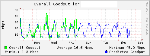
Overall goodput for a controller, combined with predicted usage.
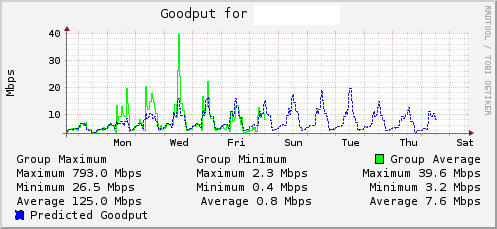
Goodput of a single AP group, combined with the predicted data.
As you can see the averaging has meant spikes in goodput value are generally ignored. While the prediction isn’t 100% accurate, it’s doing quite well considering we’ve had a number of special events recently. Either way, the AP group data is giving us real insight into usage patterns across different buildings.
If you’re looking to take advantage of this prediction feature for yourself, here’s the RRDtool graph command I’ve been using to generate the above images:
rrdtool graph output.png

	--start=end-1w,

    --title=Goodput for NAME,

	--vertical-label=Mbps

	DEF:goodput=overall_goodput.rrd:goodput:AVERAGE

    CDEF:adjgoodput=goodput,1048576,/

    CDEF:predicted=86400,-7,900,adjgoodput,PREDICT

    LINE1:adjgoodput#00FF00:Overall Goodput

    GPRINT:adjgoodput:AVERAGE:Average %.1lf Mbps

    GPRINT:adjgoodput:MAX:Maximum %.1lf Mbps

    GPRINT:adjgoodput:MIN:Minimum %.1lf Mbps

    LINE1:predicted#0000FF:Predicted Goodput:dashes=2